![]()
1.7. Visualization with Matplotlib and Cartopy#
1.7.1. Matplotlib#

Matplotlib: Matplotlib is a comprehensive library for creating static, animated, and interactive visualizations in Python.
Website: https://matplotlib.org/
GitHub: matplotlib/matplotlib
In the previous notebook, we saw some basic examples of plotting and visualization in the context of learning numpy. In this notebook, we dive much deeper. The goal is to understand how matplotlib represents figures internally.
from matplotlib import pyplot as plt
import numpy as np
%matplotlib inline
1.7.2. Figure and Axes#
The figure is the highest level of organization of matplotlib objects. If we want, we can create a figure explicitly.
fig = plt.figure()
<Figure size 640x480 with 0 Axes>
fig = plt.figure(figsize=(13, 5))
<Figure size 1300x500 with 0 Axes>
fig = plt.figure()
ax = fig.add_axes([0, 0, 1, 1])
fig = plt.figure()
ax = fig.add_axes([0, 0, 0.5, 1])
fig = plt.figure()
ax1 = fig.add_axes([0, 0, 0.5, 1])
ax2 = fig.add_axes([0.6, 0, 0.3, 0.5], facecolor='g')
1.7.3. Subplots#
Subplot syntax is one way to specify the creation of multiple axes.
fig = plt.figure()
axes = fig.subplots(nrows=2, ncols=3)
fig = plt.figure(figsize=(12, 6))
axes = fig.subplots(nrows=2, ncols=3)
axes
array([[<Axes: >, <Axes: >, <Axes: >],
       [<Axes: >, <Axes: >, <Axes: >]], dtype=object)
There is a shorthand for doing this all at once, which is our recommended way to create new figures!
fig, ax = plt.subplots()
fig, axes = plt.subplots(ncols=2, figsize=(8, 4), subplot_kw={'facecolor': 'g'})
axes
array([<Axes: >, <Axes: >], dtype=object)
1.7.4. Drawing into Axes#
All plots are drawn into axes. It is easiest to understand how matplotlib works if you use the object-oriented style.
# create some data to plot
import numpy as np
x = np.linspace(-np.pi, np.pi, 100)
y = np.cos(x)
z = np.sin(6*x)
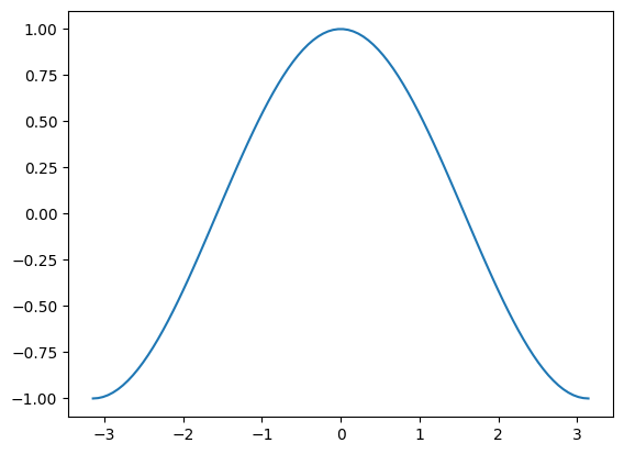
fig, ax = plt.subplots()
ax.plot(x, y)
[<matplotlib.lines.Line2D at 0x19275cff970>]
This does the same thing as
plt.plot(x, y)
[<matplotlib.lines.Line2D at 0x19278132d30>]
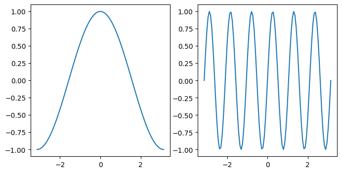
This starts to matter when we have multiple axes to worry about.
fig, axes = plt.subplots(figsize=(8, 4), ncols=2)
ax0, ax1 = axes
ax0.plot(x, y)
ax1.plot(x, z)
[<matplotlib.lines.Line2D at 0x19277ffdc70>]
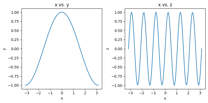
1.7.5. Labeling Plots#
fig, axes = plt.subplots(figsize=(8, 4), ncols=2)
ax0, ax1 = axes

ax0.plot(x, y)
ax0.set_xlabel('x')
ax0.set_ylabel('y')
ax0.set_title('x vs. y')

ax1.plot(x, z)
ax1.set_xlabel('x')
ax1.set_ylabel('z')
ax1.set_title('x vs. z')

# squeeze everything in
plt.tight_layout()
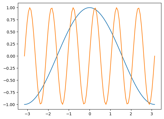
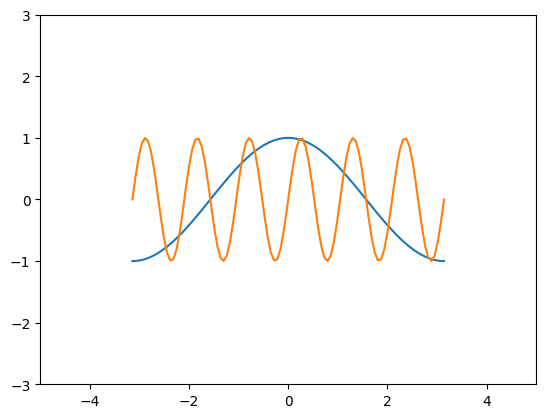
1.7.6. Customizing Line Plots#
fig, ax = plt.subplots()
ax.plot(x, y, x, z)
[<matplotlib.lines.Line2D at 0x1927810e130>,
 <matplotlib.lines.Line2D at 0x1927850c2e0>]
# It’s simple to switch axes
fig, ax = plt.subplots()
ax.plot(y, x, z, x)
[<matplotlib.lines.Line2D at 0x19278594ca0>,
 <matplotlib.lines.Line2D at 0x19278594d00>]
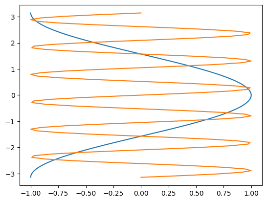
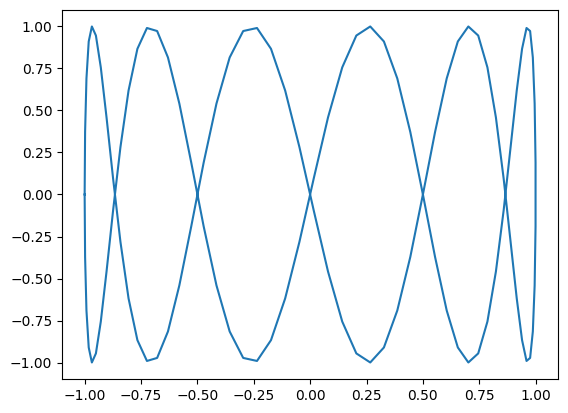
A “parametric” graph:
fig, ax = plt.subplots()
ax.plot(y, z)
[<matplotlib.lines.Line2D at 0x1927861ecd0>]
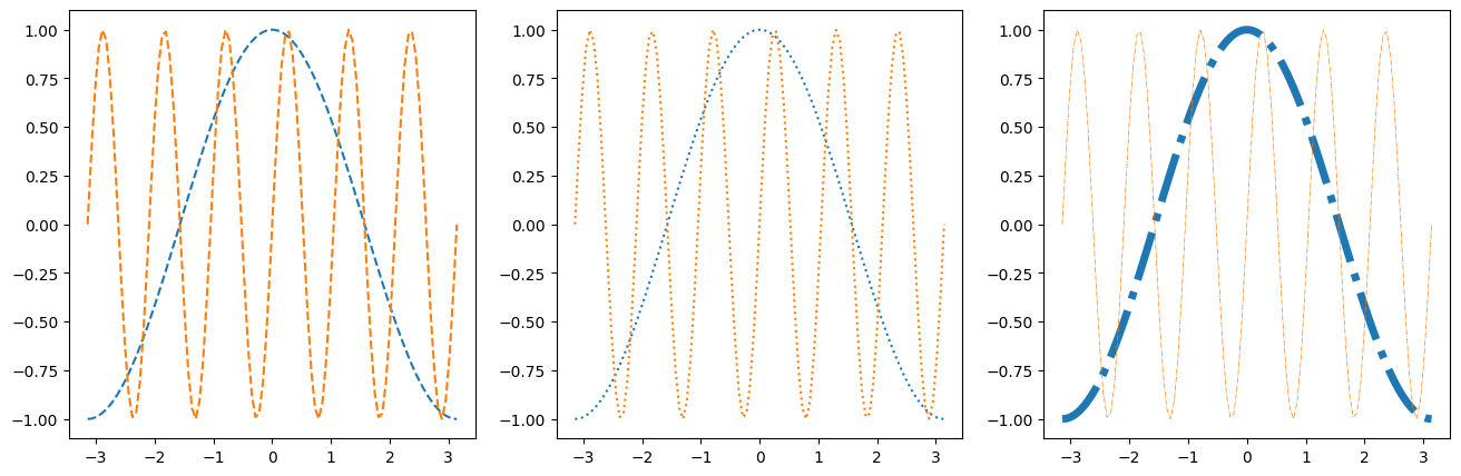
1.7.6.1. Line Styles#
fig, axes = plt.subplots(figsize=(16, 5), ncols=3)
axes[0].plot(x, y, linestyle='dashed')
axes[0].plot(x, z, linestyle='--')

axes[1].plot(x, y, linestyle='dotted')
axes[1].plot(x, z, linestyle=':')

axes[2].plot(x, y, linestyle='dashdot', linewidth=5)
axes[2].plot(x, z, linestyle='-.', linewidth=0.5)
[<matplotlib.lines.Line2D at 0x19279ac88e0>]
1.7.6.2. Colors#
As described in the colors documentation, there are some special codes for commonly used colors:
b: blue
g: green
r: red
c: cyan
m: magenta
y: yellow
k: black
w: white
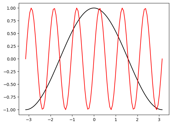
fig, ax = plt.subplots()
ax.plot(x, y, color='k')
ax.plot(x, z, color='r')
[<matplotlib.lines.Line2D at 0x19279b14460>]
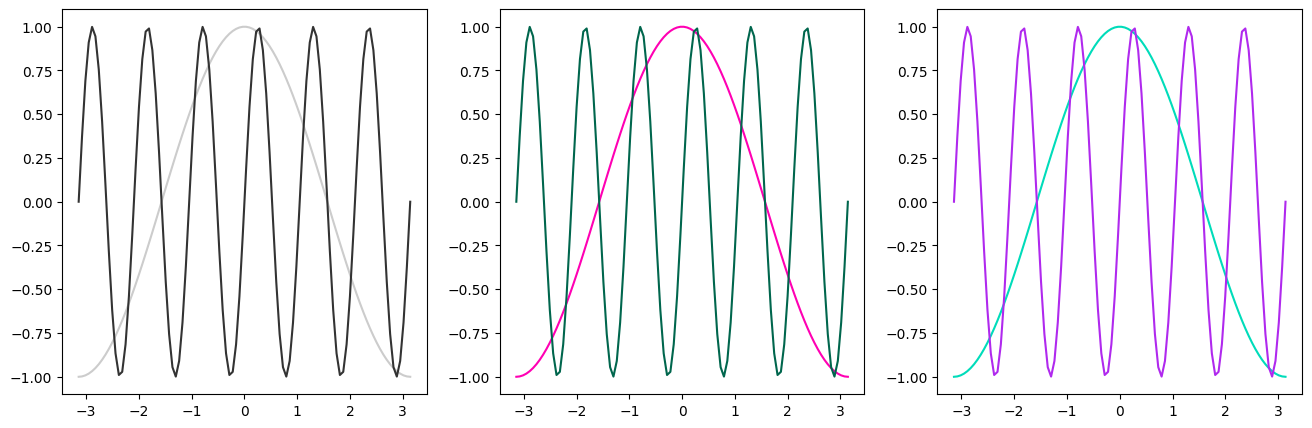
# Other ways to specify colors:

fig, axes = plt.subplots(figsize=(16, 5), ncols=3)

# grayscale
axes[0].plot(x, y, color='0.8')
axes[0].plot(x, z, color='0.2')

# RGB tuple
axes[1].plot(x, y, color=(1, 0, 0.7))
axes[1].plot(x, z, color=(0, 0.4, 0.3))

# HTML hex code
axes[2].plot(x, y, color='#00dcba')
axes[2].plot(x, z, color='#b029ee')
[<matplotlib.lines.Line2D at 0x19279be10d0>]
There is a default color cycle built into matplotlib.
plt.rcParams['axes.prop_cycle']
| 'color' |
|---|
| '#1f77b4' |
| '#ff7f0e' |
| '#2ca02c' |
| '#d62728' |
| '#9467bd' |
| '#8c564b' |
| '#e377c2' |
| '#7f7f7f' |
| '#bcbd22' |
| '#17becf' |
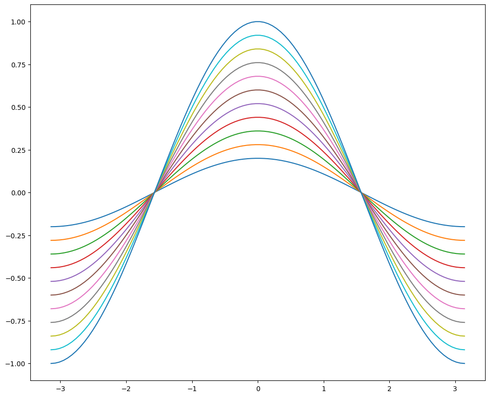
fig, ax = plt.subplots(figsize=(12, 10))
for factor in np.linspace(0.2, 1, 11):
    ax.plot(x, factor*y)
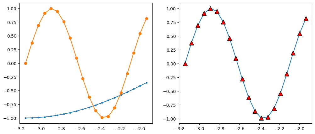
1.7.6.3. Markers#
There are lots of different markers availabile in matplotlib!
fig, axes = plt.subplots(figsize=(12, 5), ncols=2)

axes[0].plot(x[:20], y[:20], marker='.')
axes[0].plot(x[:20], z[:20], marker='o')

axes[1].plot(x[:20], z[:20], marker='^',
             markersize=10, markerfacecolor='r',
             markeredgecolor='k')
[<matplotlib.lines.Line2D at 0x19279ce9370>]
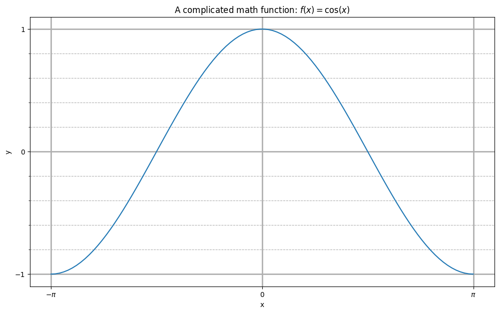
1.7.6.4. Label, Ticks, and Gridlines#
fig, ax = plt.subplots(figsize=(12, 7))
ax.plot(x, y)

ax.set_xlabel('x')
ax.set_ylabel('y')
ax.set_title(r'A complicated math function: $f(x) = \cos(x)$')

ax.set_xticks(np.pi * np.array([-1, 0, 1]))
ax.set_xticklabels([r'$-\pi$', '0', r'$\pi$'])
ax.set_yticks([-1, 0, 1])

ax.set_yticks(np.arange(-1, 1.1, 0.2), minor=True)
#ax.set_xticks(np.arange(-3, 3.1, 0.2), minor=True)

ax.grid(which='minor', linestyle='--')
ax.grid(which='major', linewidth=2)
1.7.6.5. Axis Limits#
fig, ax = plt.subplots()
ax.plot(x, y, x, z)
ax.set_xlim(-5, 5)
ax.set_ylim(-3, 3)
(-3.0, 3.0)
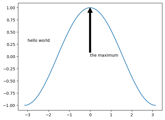
1.7.6.6. Text Annotations#
fig, ax = plt.subplots()
ax.plot(x, y)
ax.text(-3, 0.3, 'hello world')
ax.annotate('the maximum', xy=(0, 1),
             xytext=(0, 0), arrowprops={'facecolor': 'k'})
Text(0, 0, 'the maximum')
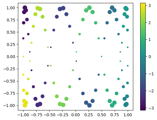
1.7.6.7. Scatter Plots#
fig, ax = plt.subplots()

splot = ax.scatter(y, z, c=x, s=(100*z**2 + 5))
fig.colorbar(splot)
<matplotlib.colorbar.Colorbar at 0x1927a2fa7c0>
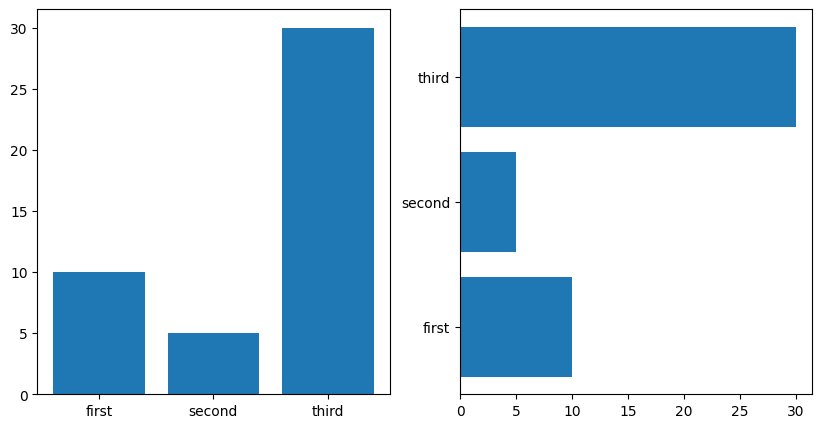
1.7.6.8. Bar Plots#
labels = ['first', 'second', 'third']
values = [10, 5, 30]

fig, axes = plt.subplots(figsize=(10, 5), ncols=2)
axes[0].bar(labels, values)
axes[1].barh(labels, values)
<BarContainer object of 3 artists>
1.7.7. 2D Plotting Methods#
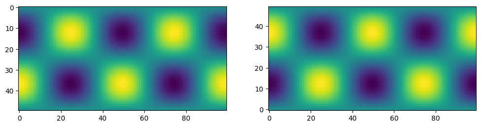
1.7.7.1. imshow#
## imshow
x1d = np.linspace(-2*np.pi, 2*np.pi, 100)
y1d = np.linspace(-np.pi, np.pi, 50)
xx, yy = np.meshgrid(x1d, y1d)
f = np.cos(xx) * np.sin(yy)
print(f.shape)
(50, 100)
fig, ax = plt.subplots(figsize=(12,4), ncols=2)
ax[0].imshow(f)
ax[1].imshow(f, origin='lower')
<matplotlib.image.AxesImage at 0x1927a383fa0>
1.7.7.2. pcolormesh#
fig, ax = plt.subplots(ncols=2, figsize=(12, 5))
pc0 = ax[0].pcolormesh(x1d, y1d, f)
pc1 = ax[1].pcolormesh(xx, yy, f)
fig.colorbar(pc0, ax=ax[0])
fig.colorbar(pc1, ax=ax[1])
<matplotlib.colorbar.Colorbar at 0x1927c353d00>
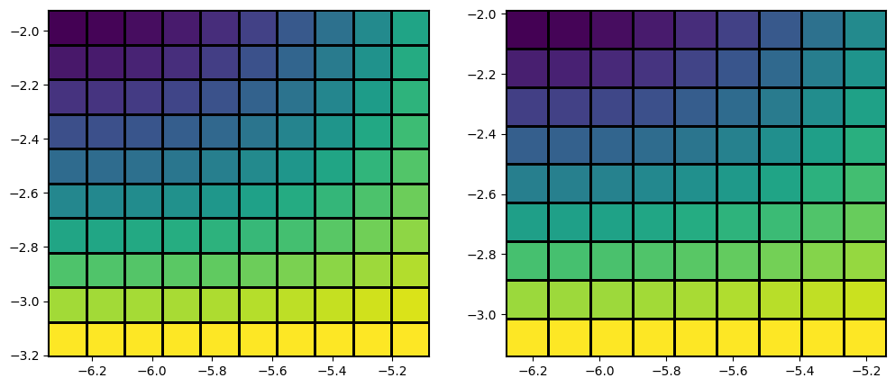
x_sm, y_sm, f_sm = xx[:10, :10], yy[:10, :10], f[:10, :10]

fig, ax = plt.subplots(figsize=(12,5), ncols=2)

# last row and column ignored!
ax[0].pcolormesh(x_sm, y_sm, f_sm, edgecolors='k')

# same!
ax[1].pcolormesh(x_sm, y_sm, f_sm[:-1, :-1], edgecolors='k')
<matplotlib.collections.QuadMesh at 0x19275dfa910>
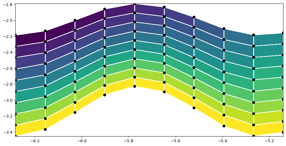
y_distorted = y_sm*(1 + 0.1*np.cos(6*x_sm))

plt.figure(figsize=(12,6))
plt.pcolormesh(x_sm, y_distorted, f_sm[:-1, :-1], edgecolors='w')
plt.scatter(x_sm, y_distorted, c='k')
<matplotlib.collections.PathCollection at 0x19279df86d0>
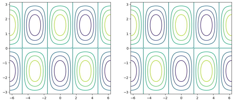
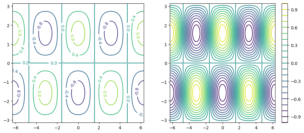
1.7.7.3. contour / contourf#
fig, ax = plt.subplots(figsize=(12, 5), ncols=2)

# same thing!
ax[0].contour(x1d, y1d, f)
ax[1].contour(xx, yy, f)
<matplotlib.contour.QuadContourSet at 0x1927a1c70a0>
fig, ax = plt.subplots(figsize=(12, 5), ncols=2)

c0 = ax[0].contour(xx, yy, f, 5)
c1 = ax[1].contour(xx, yy, f, 20)

plt.clabel(c0, fmt='%2.1f')
plt.colorbar(c1, ax=ax[1])
<matplotlib.colorbar.Colorbar at 0x1927ad99cd0>
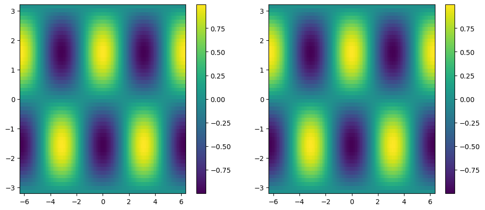
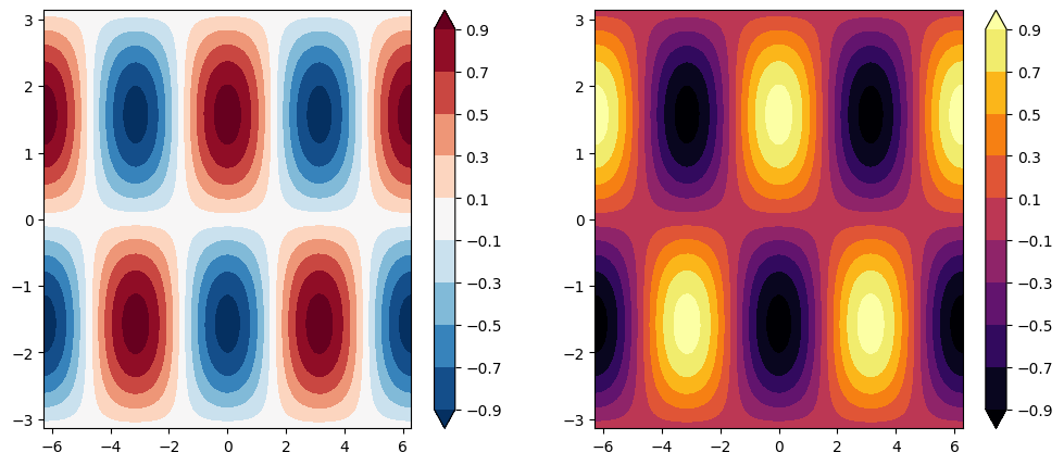
fig, ax = plt.subplots(figsize=(12, 5), ncols=2)

clevels = np.arange(-1, 1, 0.2) + 0.1

cf0 = ax[0].contourf(xx, yy, f, clevels, cmap='RdBu_r', extend='both')
cf1 = ax[1].contourf(xx, yy, f, clevels, cmap='inferno', extend='both')

fig.colorbar(cf0, ax=ax[0])
fig.colorbar(cf1, ax=ax[1])
<matplotlib.colorbar.Colorbar at 0x1927c64bbe0>
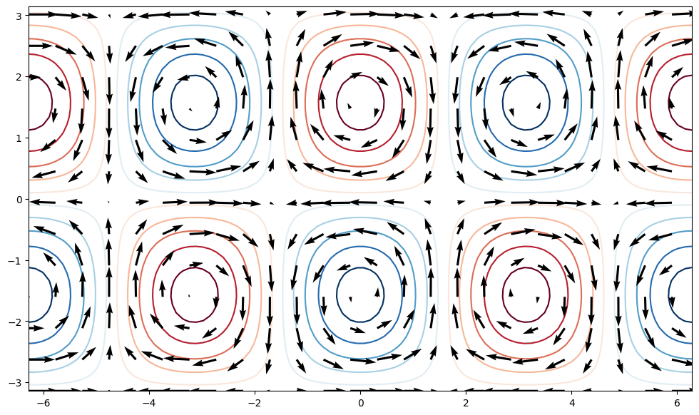
1.7.7.4. quiver#
u = -np.cos(xx) * np.cos(yy)
v = -np.sin(xx) * np.sin(yy)

fig, ax = plt.subplots(figsize=(12, 7))
ax.contour(xx, yy, f, clevels, cmap='RdBu_r', extend='both', zorder=0)
ax.quiver(xx[::4, ::4], yy[::4, ::4],
           u[::4, ::4], v[::4, ::4], zorder=1)
<matplotlib.quiver.Quiver at 0x1927c7486d0>
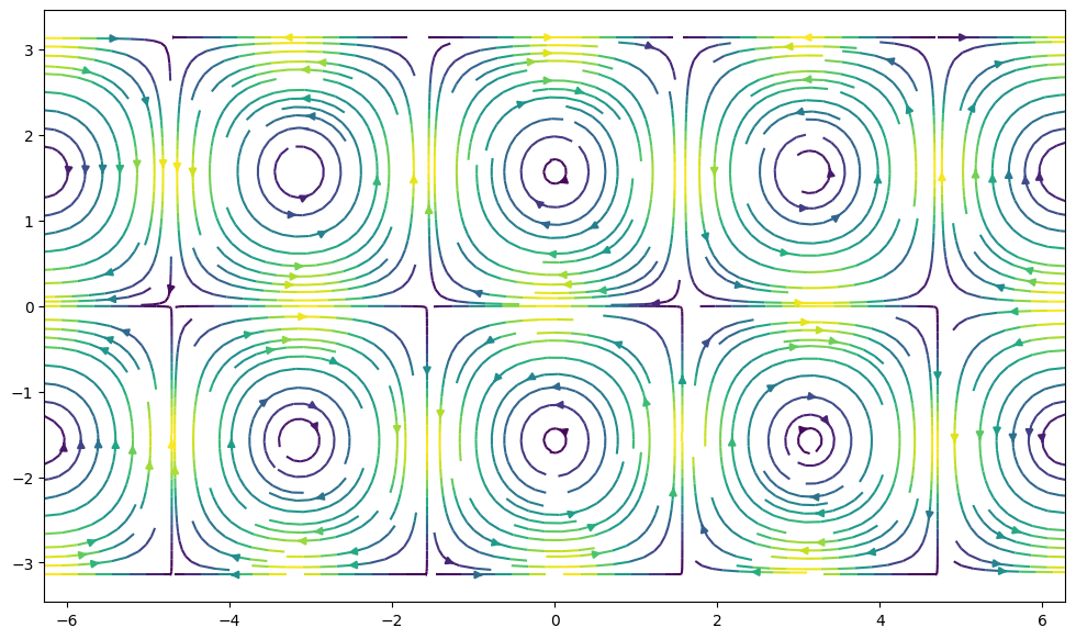
1.7.7.5. streamplot#
fig, ax = plt.subplots(figsize=(12, 7))
ax.streamplot(xx, yy, u, v, density=2, color=(u**2 + v**2))
<matplotlib.streamplot.StreamplotSet at 0x1927d2a1a90>
1.7.8. Cartopy#

Making maps is a fundamental part of geoscience research. Maps differ from regular figures in the following principle ways:
Maps require a projection of geographic coordinates on the 3D Earth to the 2D space of your figure.
Maps often include extra decorations besides just our data (e.g. continents, country borders, etc.)
Mapping is a notoriously hard and complicated problem, mostly due to the complexities of projection.
In this lecture, we will learn about Cartopy, one of the most common packages for making maps within python. Another popular and powerful library is Basemap; however, Basemap is going away and being replaced with Cartopy in the near future. For this reason, new python learners are recommended to learn Cartopy.
A lot of the material in this lesson was adopted from Phil Elson’s excellent Cartopy Tutorial. Phil is the creator of Cartopy and published his tutorial under an open license.
1.7.9. Background: Projections#
Most of our media for visualization are flat. Our two most common media are flat:
Paper
Screen

1.7.10. Introducing Cartopy#
Cartopy makes use of the powerful PROJ, numpy and shapely libraries and includes a programatic interface built on top of matplotlib for the creation of publication quality maps.
Key features of cartopy are its object oriented projection definitions, and its ability to transform points, lines, vectors, polygons and images between those projections.
1.7.10.1. Cartopy Projections and Other Reference Systems#
In Cartopy, each projection is a class. Most classes of projection can be configured in projection-specific ways, although Cartopy takes an opinionated stance on sensible defaults.
Let’s create a Plate Carree projection instance.
To do so, we need cartopy’s crs module. This is typically imported as ccrs (Cartopy Coordinate Reference Systems).
First, let’s install cartopy to use it in this Google Colab notebook. 💻 We have to first install shapely without binary, which hopefully should prevent your Google Colab notebook from crashing.
!pip install --no-binary 'shapely==1.6.4' 'shapely==1.6.4' --force
!pip install cartopy # Install latest version of cartopy
ERROR: Invalid requirement: "'shapely==1.6.4'"
ERROR: Invalid requirement: '#'
import cartopy.crs as ccrs
import cartopy
---------------------------------------------------------------------------
ModuleNotFoundError                       Traceback (most recent call last)
Cell In[43], line 1
----> 1 import cartopy.crs as ccrs
      2 import cartopy

ModuleNotFoundError: No module named 'cartopy'
Cartopy’s projection list tells us that the Plate Carree projection is available with the ccrs.PlateCarree class:
Note: we need to instantiate the class in order to do anything related to projections with it!
ccrs.PlateCarree()
1.7.10.2. Drawing a map#
Cartopy optionally depends upon matplotlib, and each projection knows how to create a matplotlib Axes (or AxesSubplot) that can represent itself.
The Axes that the projection creates is a cartopy.mpl.geoaxes.GeoAxes. This Axes subclass overrides some of matplotlib’s existing methods, and adds a number of extremely useful ones for drawing maps.
We’ll go back and look at those methods shortly, but first, let’s actually see the cartopy+matplotlib dance in action:
%matplotlib inline
import matplotlib.pyplot as plt

plt.axes(projection=ccrs.PlateCarree())
That was a little underwhelming, but we can see that the Axes created is indeed one of those GeoAxes[Subplot] instances.
One of the most useful methods that this class adds on top of the standard matplotlib Axes class is the coastlines method. With no arguments, it will add the Natural Earth 1:110,000,000 scale coastline data to the map.
plt.figure()
ax = plt.axes(projection=ccrs.PlateCarree())
ax.coastlines()
We could have also created a matplotlib subplot with one of the many approaches that exist. For example, the plt.subplots function could be used:
fig, ax = plt.subplots(subplot_kw={'projection': ccrs.PlateCarree()})
ax.coastlines()
Projection classes have options we can use to customize the map
ccrs.PlateCarree?
ax = plt.axes(projection=ccrs.PlateCarree(central_longitude=180))
ax.coastlines()
1.7.10.3. Useful Methods of a GeoAxes#
The cartopy.mpl.geoaxes.GeoAxes class adds a number of useful methods.
Let’s take a look at:
set_global - zoom the map out as much as possible
set_extent - zoom the map to the given bounding box
gridlines - add gridlines (and optionally labels) to the axes
coastlines - add Natural Earth coastlines to the axes
stock_img - add a low-resolution Natural Earth background image to the axes
imshow - add an image (numpy array) to the axes
add_geometries - add a collection of geometries (Shapely) to the axes
1.7.10.4. Some More Examples of Different Global Projections#
projections = [ccrs.PlateCarree(),
               ccrs.Robinson(),
               ccrs.Mercator(),
               ccrs.Orthographic(),
               ccrs.InterruptedGoodeHomolosine()
              ]


for proj in projections:
    plt.figure()
    ax = plt.axes(projection=proj)
    ax.stock_img()
    ax.coastlines()
    ax.set_title(f'{type(proj)}')
1.7.10.5. Regional Maps#
To create a regional map, we use the set_extent method of GeoAxis to limit the size of the region.
central_lon, central_lat = -10, 45
extent = [-40, 20, 30, 60]
ax = plt.axes(projection=ccrs.Orthographic(central_lon, central_lat))
ax.set_extent(extent)
ax.gridlines()
ax.coastlines(resolution='50m')
1.7.11. Adding Features to the Map#
To give our map more styles and details, we add cartopy.feature objects. Many useful features are built in. These “default features” are at coarse (110m) resolution.
Name |
Description |
|---|---|
|
Country boundaries |
|
Coastline, including major islands |
|
Natural and artificial lakes |
|
Land polygons, including major islands |
|
Ocean polygons |
|
Single-line drainages, including lake centerlines |
Below we illustrate these features in a customized map of North America.
import cartopy.feature as cfeature
import numpy as np

central_lat = 37.5
central_lon = -96
extent = [-120, -70, 24, 50.5]
central_lon = np.mean(extent[:2])
central_lat = np.mean(extent[2:])

plt.figure(figsize=(12, 6))
ax = plt.axes(projection=ccrs.AlbersEqualArea(central_lon, central_lat))
ax.set_extent(extent)

ax.add_feature(cartopy.feature.OCEAN)
ax.add_feature(cartopy.feature.LAND, edgecolor='black')
ax.add_feature(cartopy.feature.LAKES, edgecolor='black')
ax.add_feature(cartopy.feature.RIVERS)
ax.gridlines()
If we want higher-resolution features, Cartopy can automatically download and create them from the Natural Earth Data database or the GSHHS dataset database.
rivers_50m = cfeature.NaturalEarthFeature('physical', 'rivers_lake_centerlines', '50m')

plt.figure(figsize=(12, 6))
ax = plt.axes(projection=ccrs.AlbersEqualArea(central_lon, central_lat))
ax.set_extent(extent)

ax.add_feature(cartopy.feature.OCEAN)
ax.add_feature(cartopy.feature.LAND, edgecolor='black')
ax.add_feature(rivers_50m, facecolor='None', edgecolor='b')
ax.gridlines()
1.7.12. Adding Data to the Map#
Now that we know how to create a map, let’s add our data to it! That’s the whole point.
Because our map is a matplotlib axis, we can use all the familiar maptplotlib commands to make plots. By default, the map extent will be adjusted to match the data. We can override this with the .set_global or .set_extent commands.
# create some test data
new_york = dict(lon=-74.0060, lat=40.7128)
honolulu = dict(lon=-157.8583, lat=21.3069)
lons = [new_york['lon'], honolulu['lon']]
lats = [new_york['lat'], honolulu['lat']]
Key point: the data also have to be transformed to the projection space.
This is done via the transform= keyword in the plotting method. The argument is another cartopy.crs object. If you don’t specify a transform, Cartopy assume that the data is using the same projection as the underlying GeoAxis.
From the Cartopy Documentation:
“The core concept is that the projection of your axes is independent of the coordinate system your data is defined in. The projection argument is used when creating plots and determines the projection of the resulting plot (i.e. what the plot looks like). The transform argument to plotting functions tells Cartopy what coordinate system your data are defined in.”
ax = plt.axes(projection=ccrs.PlateCarree())
ax.plot(lons, lats, label='Equirectangular straight line')
ax.plot(lons, lats, label='Great Circle', transform=ccrs.Geodetic())
ax.coastlines()
ax.legend()
ax.set_global()
1.7.12.1. Plotting 2D (Raster) Data#
The same principles apply to 2D data. Below we create some example data defined in regular lat / lon coordinates.
import numpy as np
lon = np.linspace(-80, 80, 25)
lat = np.linspace(30, 70, 25)
lon2d, lat2d = np.meshgrid(lon, lat)
data = np.cos(np.deg2rad(lat2d) * 4) + np.sin(np.deg2rad(lon2d) * 4)
plt.contourf(lon2d, lat2d, data)
Now we create a PlateCarree projection and plot the data on it without any transform keyword. This happens to work because PlateCarree is the simplest projection of lat / lon data.
ax = plt.axes(projection=ccrs.PlateCarree())
ax.set_global()
ax.coastlines()
ax.contourf(lon, lat, data)
However, if we try the same thing with a different projection, we get the wrong result.
projection = ccrs.RotatedPole(pole_longitude=-177.5, pole_latitude=37.5)
ax = plt.axes(projection=projection)
ax.set_global()
ax.coastlines()
ax.contourf(lon, lat, data)
To fix this, we need to pass the correct transform argument to contourf:
projection = ccrs.RotatedPole(pole_longitude=-177.5, pole_latitude=37.5)
ax = plt.axes(projection=projection)
ax.set_global()
ax.coastlines()
ax.contourf(lon, lat, data, transform=ccrs.PlateCarree())
1.7.12.2. Showing Images#
We can plot a satellite image easily on a map if we know its extent
! wget https://lance-modis.eosdis.nasa.gov/imagery/gallery/2012270-0926/Miriam.A2012270.2050.2km.jpg
fig = plt.figure(figsize=(8, 12))

# this is from the cartopy docs
fname = 'Miriam.A2012270.2050.2km.jpg'
img_extent = (-120.67660000000001, -106.32104523100001, 13.2301484511245, 30.766899999999502)
img = plt.imread(fname)

ax = plt.axes(projection=ccrs.PlateCarree())

# set a margin around the data
ax.set_xmargin(0.05)
ax.set_ymargin(0.10)

# add the image. Because this image was a tif, the "origin" of the image is in the
# upper left corner
ax.imshow(img, origin='upper', extent=img_extent, transform=ccrs.PlateCarree())
ax.coastlines(resolution='50m', color='black', linewidth=1)

# mark a known place to help us geo-locate ourselves
ax.plot(-117.1625, 32.715, 'bo', markersize=7, transform=ccrs.Geodetic())
ax.text(-117, 33, 'San Diego', transform=ccrs.Geodetic())
1.7.13. Bonus: Xarray Integration#
Cartopy transforms can be passed to xarray! This creates a very quick path for creating professional looking maps from netCDF data.
import pooch
import urllib.request
datafile = pooch.retrieve('https://unils-my.sharepoint.com/:u:/g/personal/tom_beucler_unil_ch/EdY_7ttKxltLp-u6r1MpDggBvqGb355_VecnfPRLEIsMog?download=1',
                          known_hash='af8ff05bfeb8da2ec763773bfcc06112f20cb7167613359c98a2b80313c45b73')
import xarray as xr
ds = xr.open_dataset(datafile, drop_variables=['time_bnds'])
ds
sst = ds.sst.sel(time='2000-01-01', method='nearest')
fig = plt.figure(figsize=(9,6))
ax = plt.axes(projection=ccrs.Robinson())
ax.coastlines()
ax.gridlines()
sst.plot(ax=ax, transform=ccrs.PlateCarree(),
         vmin=2, vmax=30, cbar_kwargs={'shrink': 0.4})
1.7.14. Doing More#
Browse the Cartopy Gallery to learn about all the different types of data and plotting methods available!