![]()
1.15. Statistical Graphics with Seaborn#
References:
Python Data Science Handbook (https://www.oreilly.com/library/view/python-data-science/9781491912126/)
mlcourse.ai (https://mlcourse.ai/book/topic02/topic02_additional_seaborn_matplotlib_plotly.html)
DataCamp data-science and machine learning courses (ozlerhakan/datacamp)

1.15.1. Seaborn Versus Matplotlib#
Here is an example of a simple random-walk plot in Matplotlib, using its standard plot formatting and colors.
We will show that using simple settings arguments, we can create aesthetically pleasing plots with the seaborn library.
import matplotlib.pyplot as plt
plt.style.use('classic')
%matplotlib inline
import numpy as np
import pandas as pd
First, let’s create some data and plot them with matplotlib defaults.
# Create some data
rng = np.random.RandomState(0)
x = np.linspace(0, 10, 500)
y = np.cumsum(rng.randn(500, 6), 0)
# Plot the data with Matplotlib defaults
plt.plot(x, y)
plt.legend('ABCDEF', ncol=2, loc='upper left');
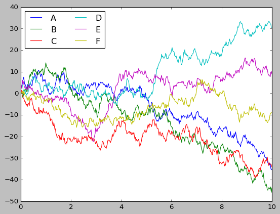
This is what we get from Matplotlib without changing any settings. It’s okay, but the color code and background look underwhelming. Can we do better?
Importing seaborn brings a lot of good. While you can use seaborn plotting functions, simply importing the package will overwrite a lot of the default settings in the Matplotlib library.
So simply rerunning the exact same Matplotlib script will yield a better figure!
import seaborn as sns
sns.set()
---------------------------------------------------------------------------
ModuleNotFoundError                       Traceback (most recent call last)
Cell In[4], line 1
----> 1 import seaborn as sns
      2 sns.set()

ModuleNotFoundError: No module named 'seaborn'
# same plotting code as above!
plt.plot(x, y)
plt.legend('ABCDEF', ncol=2, loc='upper left');
1.15.2. Exploring Datasets with seaborn#
The main idea of Seaborn is that it provides high-level commands to create a variety of plot types useful for statistical data exploration, and even some statistical model fitting.
Let’s take a look at a few of the datasets and plot types available in Seaborn. Note that all of the following could be done using raw Matplotlib commands (this is, in fact, what Seaborn does under the hood) but the Seaborn API is much more convenient.
Let’s download school data from the US using pooch.
import pooch
import pandas as pd
url = "https://unils-my.sharepoint.com/:x:/g/personal/tom_beucler_unil_ch/EdQySMPw8KlEq9QjqSpSeVsBreCRvf_vK1dmTBNelRfWAQ?download=1"
schoolimprov_2010grants = pooch.retrieve(url, known_hash='0cb062b892eff47098c6900f7e9ab1664d448c80e2197584617c249c9919dda4')
df = pd.read_csv(schoolimprov_2010grants)
df.head()
Here we opened a tabular file containing names and location of some schools in the US. The table also contains information on how much grant money individual schools got in 2010.
1.15.2.1. Histograms, KDE, and densities#
Often in statistical data visualization, all you want is to plot histograms and joint distributions of variables. We have seen that this is relatively straightforward in Matplotlib.
First, let’s pull out schools in Southern and Western US from the table.
isWEST,isSOUTH = df['Region']=='West',df['Region']=='South'
dfWEST,dfSOUTH = df[isWEST],df[isSOUTH]
In Matplotlib, we may e.g., use the hist function of the Pyplot package
colors=['r','b']
labels = ['West','South']
for ind,obj in enumerate([dfWEST,dfSOUTH]):
  plt.hist(obj['Award_Amount'], color=colors[ind],label=labels[ind])
plt.legend()
Seaborn already made it look much nicer. But it can easily do more, including density estimates and automatic labeling, as demonstrated below:
for ind,obj in enumerate([dfWEST,dfSOUTH]):
  sns.kdeplot(obj['Award_Amount'], shade=True,color=colors[ind],label=labels[ind])
plt.legend(loc=1)
plt.show()
1.15.2.2. KDE#
We just used seaborn to plot the distribution functions of the amount of grant money received the two different categories of schools we just pull out.
Here we used the kdeplot function to get a kernel density estimate (KDE) plot. This kind of plot is analogous to histograms, but the distributions is quite smooth. This is because seaborn will try to find a function that best represent the continuous probability density function (PDF) of a given dataset, rather than simply counting the number of data in each data bin.
From the seaborn official website:
Relative to a histogram, KDE can produce a plot that is less cluttered and more interpretable, especially when drawing multiple distributions. But it has the potential to introduce distortions if the underlying distribution is bounded or not smooth. Like a histogram, the quality of the representation also depends on the selection of good smoothing parameters.
We can change how our plot looks like
fig,ax = plt.subplots(figsize=(10,5))
for ind,obj in enumerate([dfWEST,dfSOUTH]):
  sns.kdeplot(obj['Award_Amount'], shade=False,ax=ax,
              color=colors[ind],label=labels[ind],
              linestyle='--',linewidth=4)
plt.legend(loc=1,prop={'size':18})
plt.xticks([-400000,0,400000,800000,1200000])
plt.yticks(np.linspace(0,0.0000018,7))
plt.ylim(0,0.00000195)
plt.title('Changing the behaviour of SEABORN plots',loc='left',fontsize=15)
plt.show()
It is much easier to read now!
Let’s combine a histogram using histplot with a KDE plot using kdeplot:
fig,ax = plt.subplots(1,1,figsize=(10,5))
for ind,obj in enumerate([dfWEST,dfSOUTH]):
  sns.histplot(obj['Award_Amount'],ax=ax,stat='density',
               color=colors[ind],label=labels[ind],
               alpha=0.2,
               kde_kws={'linestyle':'-','linewidth':4})
  sns.kdeplot(obj['Award_Amount'],ax=ax,
              color=colors[ind],label=labels[ind],
              linewidth=4)
plt.legend(loc=1,prop={'size':18})
plt.xticks([-400000,0,400000,800000,1200000])
plt.title('Combining KDE plots and Histograms',loc='left',fontsize=15)
plt.show()
fig,ax = plt.subplots(1,1,figsize=(10,5))
for ind,obj in enumerate([dfWEST,dfSOUTH]):
  sns.distplot(obj['Award_Amount'],kde=False,ax=ax,color=colors[ind],
               label=labels[ind],kde_kws={'linestyle':'-','linewidth':4})
plt.legend(loc=1,prop={'size':18})
plt.title('Histograms',loc='left',fontsize=15)
plt.ylabel('Simple Counts')
plt.show()
fig,ax = plt.subplots(1,1,figsize=(8,4))
sns.distplot(dfWEST['Award_Amount'],ax=ax,color='r',label='West',
             hist=False,rug=True,kde_kws={'shade':True})
plt.legend(loc=1,prop={'size':14})
plt.xticks([-400000,0,400000,800000,1200000])
plt.yticks(np.linspace(0,0.0000018,7))
plt.ylim(0,0.00000195)
plt.show()
If we pass the full two-dimensional dataset to kdeplot, we will get a two-dimensional visualization of the data:
# Let's create some random, normally-distributed, 2D data
data = np.random.multivariate_normal([0, 0],
                                     [[5, 2], [2, 2]],
                                     size=2000)
data = pd.DataFrame(data, columns=['x', 'y'])
# And plot it
sns.kdeplot(x=data['x'],y=data['y']);
Now, a really convenient function that plots both the 2D density function as well as its 1D marginals is jointplot.
with sns.axes_style('white'):
    sns.jointplot(data=data,x="x",y="y",kind='kde');
with sns.axes_style('white'):
    sns.jointplot(x="x", y="y", data=data, kind='hex')
Click this link for other settings in the jointplot() method
Seaborn also conveniently includes statistical modeling utilities, such as its linear regression plot regplot:
sns.regplot(x="x", y="y", data=data,
            scatter_kws={'color':'b'},line_kws={'color':'k'})
plt.title('Estimating y from x');
1.15.3. Changing plotting styles in Seaborn: Faceted histograms#
Sometimes the best way to visualize data is via histograms of subsets. Seaborn’s FacetGrid makes this extremely simple.
We’ll take a look at some data that shows the amount that restaurant staff receive in tips based on various indicator data:
Check this page for detailed documentation of the FacetGrid method.
tips = sns.load_dataset('tips')
tips.head()
tips['tip_pct'] = 100 * tips['tip'] / tips['total_bill']

grid = sns.FacetGrid(tips, row="sex", col="time", margin_titles=True)
grid.map(plt.hist, "tip_pct", bins=np.linspace(0, 40, 15));
1.15.4. Catplots#
Catplots can be useful for this kind of visualization as well as they relate a numerical variable to one or more categorical variables. In plain words, they allow you to see how a parameter is distributed as a function of any other parameter, even if one parameter is a number and the other one is a category:
1.15.4.1. Boxplots#
with sns.axes_style(style='ticks'):
    g = sns.catplot(x="day",y="total_bill", hue="sex", data=tips, kind="box")
    g.set_axis_labels("Day", "Total Bill");
1.15.4.2. Bar plots#
Time series can also be plotted using sns.catplot by simply changing the argument from . In the following example, we’ll use the Planets data introduced three weeks ago.
planets = sns.load_dataset('planets')
planets.head()
with sns.axes_style('white'):
    g = sns.catplot(x="year", data=planets, aspect=2,
                    kind="count", color='steelblue')
    g.set_xticklabels(step=5)
with sns.axes_style('white'):
    g = sns.catplot(x="year", data=planets, aspect=4.0, kind='count',
                    hue='method', order=range(2001, 2015))
    g.set_ylabels('Number of Planets Discovered')
1.15.5. Heat Maps#
The last type of plot that we will cover here is heat maps. A heat map produces a color-encoded matrix that allows the visualization of a numerical variable’s distribution over two other variables, that may be continuous or categorical.
The documentation for heatmap function in seaborn can be found here.
url = "https://unils-my.sharepoint.com/:x:/g/personal/tom_beucler_unil_ch/EQI2SUuxc4FGuvhKuTpcqSsBG5aBYu-ASatoT-EEuaN3ng?download=1"
dailyshow_guests = pooch.retrieve(url, known_hash='af71277309a9f35a925312c4c55f5d9ac430c803b6ea71da5ea26a2f5d4d51d6')
df = pd.read_csv(dailyshow_guests)
df.head()
pd_crosstab = pd.crosstab(df["Group"], df["YEAR"])
pd_crosstab
We can visualize the 2D matrix above to see the profession of Daily Show guests throughout the years.
# Plot a heatmap of the table
sns.heatmap(pd_crosstab,cmap='BuGn')

# Rotate tick marks for visibility
plt.yticks(rotation=0);
plt.xticks(rotation=90);
We see that the show usually invites actors, media figures from 1999 to 2015. It invited slightly more politicians in 2004 and 2012, which coincided with election years.
url = "https://unils-my.sharepoint.com/:x:/g/personal/tom_beucler_unil_ch/EfG3joA129pFq8DjjZkb2c0Br-GNwxp6fYQKQkW-7YEaeg?download=1"
bikeshare = pooch.retrieve(url, known_hash='8fd1763d90d675db349964671b7d6a2499746bc999fcebc32e5f900889c78ef7')
df = pd.read_csv(bikeshare)
Here’s a way to perform and visualize a correlation analysis in just a few characters using bike sharing data:
sns.heatmap(df.corr());
What do you notice?